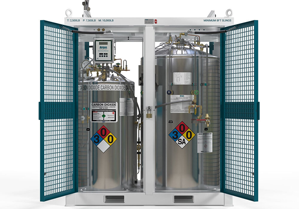
RDC Design GroupRDC Design GroupRDC Design GroupRDC Design Group
  • Welcome
  • 3D RENDERING
    • 3D Product Rendering
    • What Is 3D Product Rendering
    • FAQ
  • Web Services
    • Web Design
    • Web Development
    • Speed Optimization
  • INTERNET MARKETING
    • SEO
    • PPC
  • Other Services
    • Logo Design
    • Graphic Design
    • Motion Graphics
  • Portfolio
  • About
  • CONTACT
RDC Design Group 3D Product Rendering AES JSS 1000 450 MD - Front Open Featured Image
February 14, 2024

Airgas

  • Posted By : admin/
  • 0 comments /
  • Under :

AIRGAS

3D PRODUCT RENDERING

Project Description

Introducing Airgas’ AES Job Site Skids: Revolutionizing On-Site Welding

Here are some stunning 3D renderings we crafted for Airgas’ AES Job Site Skids.

In this project, we faced some unique challenges . . . Our task was to recreate intricate details from the CAD designs and transform them into clean models that would shine in photo-realistic beauty shots. With precision and dedication, we brought each element of the skid to life, ensuring that every pipe, gauge, dial, and component was perfectly accurate.

One of the key aspects of capturing the essence of these skids was creating realistic reflections on the tanks. To achieve this, we crafted multiple HDRI setups, allowing us to achieve lifelike reflections and create a believable metal texture that adds depth and authenticity to the renderings.

Our commitment to accuracy didn’t stop there. We recognized the importance of incorporating the various logos, stickers, and text that adorn the skids, as they play an integral role in Airgas’ branding and product identification. With attention to detail, we ensured that every logo and sticker was faithfully recreated and seamlessly integrated into the renderings, maintaining brand consistency and authenticity.

The result is a collection of remarkable 3D renderings that capture the true beauty and functionality of Airgas’ AES Job Site Skids. Each image tells a story of innovation, reliability, and craftsmanship, inviting viewers to envision themselves harnessing the power of these skids on their own job sites.

Share this


RDC-Design-Group-3D-Product-Rendering-Lashpocket-Pillow-Top-Preview-Image
May 12, 2025

Lash Pocket

  • Posted By : admin/
  • 0 comments /
  • Under :

LASHPOCKET

3D RENDERING

Project Description
RDC Design Group is proud to present this high-end 3D product visualization for LashPocket—a unique sleep accessory designed to help beauty enthusiasts protect their lash extensions overnight. Engineered for side sleepers, the LashPocket clip creates a gentle pocket in a standard pillow, cradling the user’s face and ensuring their lashes stay intact and flawless until morning.

The goal of this visualization project was to produce clean, polished renders that clearly communicated both the function and aesthetic appeal of the LashPocket. Our team created visuals that showed not only the standalone product but also how it works in context—clipped to a plush pillow, forming a protective channel for the face.

One of the primary challenges in this project was realistically portraying the pillow’s soft, fabric-deforming behavior. Traditional modeling software like 3ds Max struggles to replicate the organic folds, pulling tension, and compression that occur in soft materials. To solve this, we turned to ZBrush, a digital sculpting program better suited for fine detail work. Using ZBrush, we were able to create the nuanced wrinkles and natural pillow deformation caused by the LashPocket’s pressure—resulting in a far more believable and tactile presentation.

The final renders use carefully tuned lighting and material work to emphasize the contrast between the smooth, Pantone-inspired pink clip and the soft, satin-like texture of the pillow. Multiple camera angles were developed to highlight the product’s design, fit, and function—making it ideal for use in e-commerce, investor presentations, or instructional content.

These images not only demonstrate the practical elegance of the LashPocket but also help communicate its value to beauty professionals and consumers alike. Through intentional rendering, sculpting, and visual storytelling, RDC Design Group helped bring this innovative product to life—combining beauty, function, and thoughtful design in every frame.

Share this


rdc design group - product label design - beverage label design - 2moods vodka orange crush - overview image
June 23, 2025

2Moods

  • Posted By : admin/
  • 0 comments /
  • Under :

2MOODS

GRAPHIC DESIGN
LABEL DESIGN
3D PRODUCT RENDERING

Project Overview

At RDC Design Group, we specialize in creating product labels and packaging that do more than just look good—they sell. With years of experience in consumer product branding, we understand how to craft packaging that stands out on shelves, connects emotionally with buyers, and aligns seamlessly with the brand’s identity. Our work with 2Moods on the launch of their new Orange Crush vodka seltzer is a perfect example of that expertise in action.

The 2Moods team came to us with a new product getting ready for release and a clear creative challenge: design a label for a new flavor that feels premium, but also looks juicy, mouthwatering, and irresistibly tasty. The product—an orange-flavored vodka seltzer—would be released in two formats: a Chill version at 4% ABV and a Thrill version at 8% ABV. They wanted both to live within the same visual world, while still communicating a clear difference between the two experiences.

We began by evaluating their existing brand identity, identifying opportunities to expand it visually while staying true to their core aesthetic. We then created a custom label system that could flex across both product variants. The design features vibrant, saturated orange elements that practically burst off the can—communicating flavor, freshness, and thirst-quenching satisfaction at first glance. Clean typography, minimal graphic clutter, and a sharp layout give it a sophisticated, modern edge.

To further differentiate the two versions, we leveraged their existing color inversion strategy: the Thrill (8%) variant uses a sleek, black label to signal boldness and intensity, while the Chill (4%) version is wrapped in a crisp, white label to evoke lightness and refreshment. The two designs are clearly siblings—cohesive on shelf, but distinct enough to help consumers make the right choice for their mood.

Everything was built from the ground up in Adobe Illustrator, using precise dielines and file specs provided by the can manufacturer. We delivered fully press-ready files that allowed 2Moods to head straight to production. 

This project is a showcase of RDC’s end-to-end capabilities in product label design, package development, and brand extension. Whether it’s a new product launch or a packaging refresh, we bring together bold creativity and technical precision to deliver packaging that doesn’t just sit on the shelf—it moves.

Visit Website

Share this


Body_halo_180041_VD_01_VRayCam001_View010000-min-Thumb
May 8, 2025

Body Halo

  • Posted By : admin/
  • 0 comments /
  • Under :

Body Halo

3D PRODUCT RENDERING

Project Description

RDC Design Group is proud to present this product visualization project created for Body Halo, an innovative assistive shower device designed to enhance accessibility and comfort for individuals with limited mobility, including elderly and disabled users. The Body Halo is a circular shower hoop system that easily installs onto standard shower fixtures, delivering an enveloping, hands-free water experience that prioritizes safety, hygiene, and independence.

The goal of this project was to create high-end 3D renders that accurately showcased the design, form, and functionality of the Body Halo system in a sleek, modern style. These visuals were essential for marketing, instruction, and investor materials—clearly communicating the product’s unique value in a visually compelling way.

One of the key challenges in this project was the need to show the Body Halo in active use, with realistic water streaming from the hoop. Our team created custom 3D water simulations to replicate the natural fall, dispersion, and misting of a real shower. Using 3Ds Max and V-Ray, we combined accurate particle rendering with detailed lighting and shadow work to produce water that looked both dynamic and believable, enhancing the emotional and functional impact of the product.

Special attention was also given to the chrome materials, soft shadows, and lighting, helping emphasize the product’s modern aesthetic and technical precision. A clean black backdrop was used to isolate the form and highlight the contrast between metal and water, drawing focus to the unique ring-shaped design.

Multiple views were rendered to illustrate both the functional state (with water on) and the hardware layout (dry and detailed), allowing users to understand the product from both an operational and technical standpoint. These visuals effectively demonstrated how the Body Halo can be installed in most showers, making it a practical solution for a wide range of households and care environments.

These renders not only captured the visual essence of the Body Halo but also played a critical role in helping the client communicate its innovation and usability to consumers, medical professionals, and retailers alike.

Share this


RDC-Design-Group-Campbells-Chunky-Soup-3D-Product-Render-Open-Case-w-Single-Upfront-Thumb
May 8, 2025

Chunky

  • Posted By : admin/
  • 0 comments /
  • Under :

PREGO

3D PRODUCT RENDERING

Project Description

RDC Design Group is proud to highlight a recent collaboration with the Campbell’s Soup Company, delivering high-quality 3D product renders for their iconic Chunky line. This project focused on creating photorealistic visuals of the Chunky soup cans and packaging for use in both internal and consumer-facing applications.

Working closely with Campbell’s brand and packaging teams, RDC rendered each Chunky soup can to precise spec, ensuring every detail—from the label artwork and typography to metallic finishes and can dimensions—was faithfully reproduced. Special attention was given to lighting, striking a perfect balance that showcased the label artwork with clarity, vibrancy, and shelf-ready realism.

In addition to individual can renders, RDC developed fully built-out packaging scenes, including:

  • Closed shrink-wrapped cases with accurate transparency and reflection,

  • Opened cases showing internal arrangement and product orientation,

  • And hero shots featuring an opened case with a single enlarged can positioned in front—ideal for marketing use.

To meet the client’s needs for comprehensive visual coverage, each product variation was rendered from nine distinct angles:
Front Angle, Left Front Angle, Right Front Angle, Front, Left, Back, Right, Top, and Bottom. This full set of perspectives ensured Campbell’s could utilize the renders across digital shelves, planograms, e-commerce platforms, and promotional materials.

The entire project pipeline—from modeling and material setup to rendering and post—was executed in 3Ds Max using the V-Ray rendering engine. This allowed for precise control over lighting, reflections, and surface detail, resulting in hyper-realistic renders that elevate the Chunky brand presentation across all touchpoints.

Share this


RDC-Design-Group-Website-Design-and-Development-DMS-Service-Holter-Monitors-Tile-min
May 12, 2025

DMS Service

  • Posted By : admin/
  • 0 comments /
  • Under :

DMS Service

WEBSITE DESIGN
WEBSITE DEVELOPMENT

Project Overview

When DMS-Service, a leader in Holter monitoring solutions, sought to revamp their online presence, they turned to RDC Design Group. Their existing website no longer reflected the company’s innovative spirit or the advanced technology behind their products. The site was outdated in design, lacked intuitive navigation, and didn’t effectively showcase their flagship product, the myPatch®sl Holter recorder. Recognizing the need for a modern, user-friendly platform that could effectively communicate their offerings to healthcare professionals and patients alike, DMS-Service partnered with RDC for a complete website overhaul.dms-service.com

Discovery & Definition

Our collaboration began with in-depth discovery sessions to understand DMS-Service’s goals, target audience, and unique value propositions. Through strategic discussions, we identified the need to highlight the myPatch®sl’s features—such as its waterproof design, extended recording capabilities, and patient comfort. It was also crucial to present their range of services and support options in a clear, accessible manner. These insights laid the foundation for a website that would not only inform but also engage and convert visitors.dms-service.com

Site Architecture & Wireframing

With a clear understanding of the project’s objectives, we restructured the site’s architecture to prioritize user experience. We developed wireframes that organized content into logical, easy-to-navigate sections, ensuring that visitors could quickly find information about products, services, and support. Special attention was given to creating pathways for different user groups, including medical professionals, patients, and potential partners, facilitating a tailored browsing experience.

Custom Website Design

Building upon the wireframes, our design team crafted a custom visual identity that mirrored DMS-Service’s commitment to innovation and care. The design featured a clean, modern aesthetic with intuitive navigation and compelling imagery of the myPatch®sl in real-world scenarios. We incorporated strategic calls to action, informative content blocks, and testimonials to build trust and encourage user engagement. The responsive design ensured optimal performance across all devices, catering to the diverse needs of their audience.dms-service.com

Development & Collaboration

Transitioning from design to development, we built the website on a robust WordPress platform, providing DMS-Service with a flexible and user-friendly content management system. This choice enabled their team to easily update content, manage product information, and maintain the site without extensive technical knowledge. Throughout the development process, we maintained open lines of communication, incorporating feedback and making iterative improvements to align with DMS-Service’s vision.

Final Review & Launch

Upon completion, we conducted thorough testing to ensure the site’s functionality, performance, and compatibility across browsers and devices. We coordinated closely with DMS-Service to plan a seamless launch, minimizing downtime and ensuring a smooth transition from the old site to the new. Post-launch, we provided training and support to empower their team to manage and update the site confidently.

The Result

The new DMS-Service website stands as a testament to their dedication to advancing cardiac monitoring technology. It effectively communicates the benefits of the myPatch®sl, offers valuable resources to healthcare providers and patients, and positions DMS-Service as a forward-thinking leader in their field. With improved navigation, compelling design, and a scalable platform, the website is poised to support their growth and innovation for years to come.

Visit Website

Share this


RDC-Design-Group-3D-Lifestyle-Render-MixWave-Underoath-Drum-Kit-Thumb
May 8, 2025

MIXWAVE

  • Posted By : admin/
  • 0 comments /
  • Under :

MIXWAVE

3D LIFESTYLE RENDERING
3D USER INTERFACE RENDERING

Project Description

RDC Design Group is excited to unveil a recent 3D rendering project developed in collaboration with MixWave and renowned artist Aaron Gillespie of Underoath. This project focused on crafting a lifelike 3D lifestyle render of Gillespie’s signature drum kit, designed to enhance the visual and interactive experience of MixWave’s audio plugin dedicated to his distinct playing style.

Working closely with both MixWave and Aaron, RDC meticulously recreated his hybrid drum setup—featuring his custom shells, cymbal choices, and hardware nuances that define the aggressive yet melodic energy of Underoath’s sound. The 3D visuals offer users the flexibility to swap out components like toms, snares, cymbals, and kick configurations to match Gillespie’s live and studio setups.

The project was executed from modeling to final look-development using 3Ds Max and V-Ray, resulting in a high-fidelity, photorealistic drum kit environment. Every element—from lighting and materials to the stage-inspired setting—was designed to reflect the intensity and authenticity of Aaron’s performances.

To add personality and storytelling, RDC incorporated ambient scene details like worn floor mats, backstage cases, and a vintage mic stand—paying homage to Aaron’s role as both drummer and vocalist. These were refined in Photoshop during post-production, creating an engaging and immersive visual that resonates with fans and musicians alike.

In addition to the core 3D visuals, RDC also created the interactive 3D user interface controls within the MixWave plugin. These controls allow users to intuitively modify drum configurations, mic placements, and tonal settings—delivering an experience that captures Aaron Gillespie’s dynamic, emotionally charged approach to drumming and performance.

Share this


RDC Design Group - TCI Manufacturing - Web Design Web Development - Overview Image
April 17, 2025

TCI MANUFACTURING

  • Posted By : admin/
  • 0 comments /
  • Under :

TCI MFG

WEBSITE DESIGN
WEBSITE DEVELOPMENT

Project Overview

When TCI Manufacturing set out to reintroduce their brand to the market with a bold new visual identity, they knew their website had to follow suit. Their previous site had grown outdated—both in its appearance and in its functionality. It lacked a clear organizational structure, making it difficult for users to quickly find the information they needed about TCI’s extensive product line and services. It was time for a full overhaul.

Discovery & Definition

We began the project by diving into the Discovery and Definition phase. Through collaborative meetings and strategic workshops with the TCI team, we gained a clear understanding of their goals, audience, and the types of content that needed to be prioritized. It was essential that the new site not only looked modern, but also reflected TCI’s leadership in the manufacturing industry—while being easy to navigate and manage internally.

Site Architecture & Wireframing

Next, we turned those insights into action by developing a new site architecture and wireframes. These planning tools allowed us to reorganize the site structure into logical, user-friendly pathways. The goal was to ensure that visitors—whether customers, partners, or job seekers—could easily find the right information in just a few clicks. Wireframes provided a visual layout of key pages and content sections, setting the foundation for a seamless design and development process.

Custom Website Design

Once the blueprint was approved, RDC crafted a custom website design that brought TCI’s new branding to life. We created a bold, modern look with clean lines, intuitive navigation, and strong imagery that showcased TCI’s work and capabilities. The design also included strategic calls to action, product highlights, and space for testimonials—building both credibility and conversion potential.

Development & Collaboration

With the design in place, RDC moved into the development phase. The site was built within a dedicated development environment, allowing for staged progress and regular review checkpoints. This iterative approach ensured that TCI could see how the project was evolving in real-time, provide feedback along the way, and feel confident at each milestone.

We developed the website in WordPress, providing TCI with a user-friendly content management system that their internal team could easily update without requiring technical expertise. WordPress also positioned the site for strong SEO performance, thanks to its flexibility, plugin ecosystem, and alignment with Google’s best practices.

Final Review & Launch

Once the build was complete and thoroughly tested, RDC coordinated with TCI to plan a smooth and strategic go-live launch. We scheduled deployment to minimize disruption, ensured all redirects and technical configurations were in place, and made the transition from old site to new as seamless as possible.

The Result

The final product is a sleek, modern website that captures the strength and innovation of TCI Manufacturing. It showcases their capabilities, highlights their impact in the industry, and provides a solid foundation for future growth. With a clean design, intuitive navigation, and powerful backend tools, the new site is built to serve both their customers and their internal team for years to come.

Visit Website

Share this


RDC Design Group - M5 Supply - Logo Design
March 31, 2025

M5 Supply

  • Posted By : admin/
  • 0 comments /
  • Under :

M5 SUPPLY

LOGO DESIGN

Project Description

M5 Supply is a rapidly growing packaging manufacturer and distributor in the United States, offering solution-based packaging options tailored to businesses of all sizes. As they expanded, they recognized the need for a strong, professional brand identity that would not only reflect their expertise and innovation in packaging solutions but also establish them as a trusted industry leader.

The Design Process
RDC Design Group took a strategic, research-driven approach to the M5 Supply logo design, beginning with an in-depth intake and creative brief. This phase was critical in uncovering key aspects of M5’s identity, including:

  • Who They Are – Understanding M5 Supply’s mission, values, and what sets them apart in the competitive packaging industry.
  • Target Audience – Identifying their customer base, from small businesses to large-scale manufacturers, and ensuring the brand appeals to the right market.
  • Brand Personality & Values – Exploring the essence of M5 Supply, including qualities like reliability, efficiency, innovation, and customer-centric solutions.
  • Design Preferences – Gathering input on stylistic direction, color psychology, typography preferences, and brand positioning to ensure the final logo would align with their vision.

The Final Logo
After multiple design iterations, refinements, and feedback sessions, the final logo emerged as a perfect representation of M5 Supply’s brand. The design encapsulates their modern approach to packaging solutions, conveying strength, reliability, and innovation.

The M5 team was thrilled with the final result, expressing excitement and confidence in their new visual identity. The logo now serves as the foundation for their future branding efforts, including their website, marketing collateral, and overall company image.

Impact & Outcome
This project exemplifies the power of intentional branding. The new logo positions M5 Supply for continued growth, strengthening its presence in the packaging industry while resonating with customers and stakeholders alike. By investing in a strategic visual identity, M5 Supply is now equipped with a logo that not only looks great but also tells a compelling brand story.

Share this


Mixwave-Mario-Dupantier-3DLifestyle-Rendering-Cover-Image-min
March 27, 2025

MIXWAVE

  • Posted By : admin/
  • 0 comments /
  • Under :

MIXWAVE

3D LIFESTYLE RENDERING
3D USER INTERFACE RENDERING

Project: 3D Drum Kit Rendering for Mixwave – Mario Duplantier Signature Kit

RDC Design Group had the exciting opportunity to collaborate with Mixwave to create high-quality 3D renderings for their drum software, featuring the signature drum kit of Mario Duplantier, drummer of the renowned metal band Gojira.

Our team meticulously modeled and rendered Mario’s drum kit to exact specifications, ensuring every detail—from the shells to the hardware—matched the real-world counterpart. The project also required multiple variations of the kit, including alternate cymbals and snares, providing flexibility for Mixwave’s software users.

To bring the kit to life, we placed it within a stunning lifestyle render, featuring a glass apartment with an oceanfront view, adding an immersive and visually striking backdrop. Additionally, we animated the kick pedals for added realism and supplied alpha channels for each individual drum, enabling Mixwave to integrate seamless user interaction within their software.

This project showcased our expertise in high-fidelity modeling, rendering, and animation, delivering a premium digital representation of one of metal’s most iconic drum kits.

Share this


‹ Prev12345Next ›Last »

Recent Posts

    Recent Comments

    No comments to show.
    Recent Comments
      Archives
      Categories
      • No categories
      Meta
      • Log in
      • Entries feed
      • Comments feed
      • WordPress.org
      Archives
      Categories
      • No categories