RDC Design GroupRDC Design GroupRDC Design GroupRDC Design Group
  • Welcome
  • 3D RENDERING
    • 3D Product Rendering
    • What Is 3D Product Rendering
    • FAQ
  • Web Services
    • Web Design
    • Web Development
    • Speed Optimization
  • INTERNET MARKETING
    • SEO
    • PPC
  • Other Services
    • Logo Design
    • Graphic Design
    • Motion Graphics
  • Portfolio
  • About
  • CONTACT
RDC Design Group – 3D Product Rendering – Food and Beverage – Lenny and Larrys Dip’d Wafer – Overview Image
January 22, 2026

Lenny and Larry’s Dip’d Wafers

  • Posted By : admin/
  • 0 comments /
  • Under :

GLOW365

3D PRODUCT RENDERING

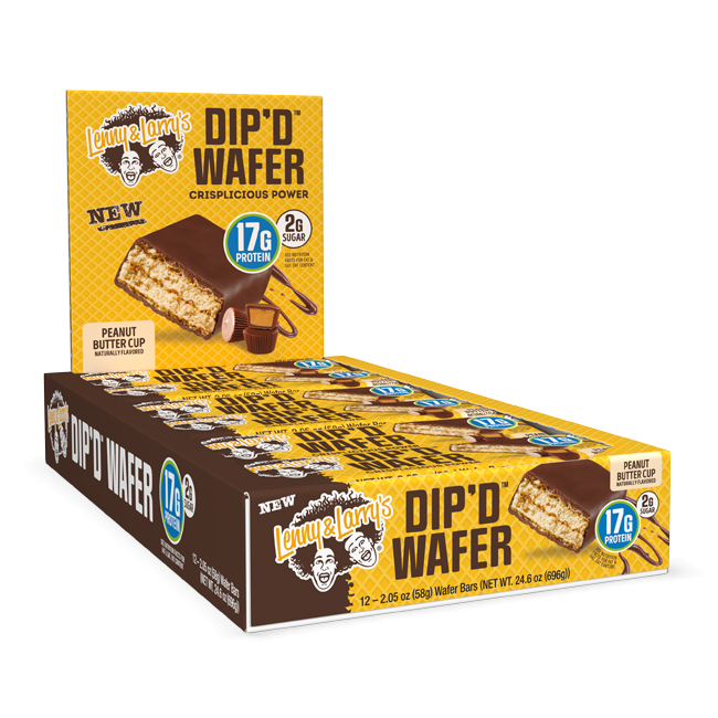
For Lenny & Larry’s, a brand best‑known for protein‑packed cookies and better‑for‑you snacks, we partnered to bring their newest product line — Dip’d Wafer Bars — to life through clean, high‑impact 3D product visualization. The goal was to create shelf‑ready visuals of both the individual wafer packaging and the 12‑count retail caddies used in stores.

Project Overview

Lenny & Larry’s introduced the Dip’d Wafer Bar — a crispy, layered wafer snack with creamy filling coated in chocolate, available in multiple flavor varieties including Peanut Butter Cup, Chocolate Mint Brownie, Caramel Macchiato, and Maple French Toast — designed to bridge nostalgic confectionery appeal with modern high‑protein positioning.

To support this launch, the brand needed photoreal product visuals for:

  • Individual wafer bar film packaging — showcasing each flavor’s unique branding and structural form.
  • Store display caddies — rendering 12‑count boxes and display units for retailer presentations and point‑of‑sale materials.

Our Approach

1. Accurate 3D Modeling of Packaging Structures

We began by recreating the wafer bar film packaging in detailed 3D:

  • Precisely modeling each wrapper’s folds, seals, and contours for photoreal fidelity.
  • Applying high‑resolution label artwork and accurate material shaders to reflect film sheen and printing cues.
  • Ensuring true‑to‑life scale so the rendered objects could be used across digital catalogs, packaging comps, and retail previews.

2. Caddy & Display Render Development

Once individual packs were finalized, we built the 12‑count caddy structures:

  • Designed virtual display prototypes matching the client’s dieline specifications.
  • Positioned packs within the caddy to emphasize face‑forward graphics and flavor variety.
  • Created multiple viewing angles to support ecommerce assets, spec sheets, and buyer decks.

3. Lighting, Materials & Render Styling

We elevated the scenes with tailored lighting and material setups:

  • Use of soft HDRI lighting to capture true textures on glossy film and cardboard stocks.
  • Refined material properties for film reflections, printed ink saturation, and die‑cut edges.
  • Output in both crisp white‑background product shots and contextual retail display scenes.

Results & Deliverables

The final renders delivered to Lenny & Larry’s included:

  • Photoreal 3D product images for each Dip’d Wafer flavor.
  • Turntable and isolated views ready for web, e‑comm, and print.
  • 12‑count caddy visualizations showing retail readiness and assortment presentation.

These assets supported the client’s launch planning — helping internal teams and retail partners visualize the product’s shelf presence well before physical samples were available.

Share this


RDC Website Design Example
January 22, 2026

Chocolatier

  • Posted By : admin/
  • 0 comments /
  • Under :

FRANCHISE

WEBSITE DESIGN
WEBSITE DEVELOPMENT

Project Overview

RDC was brought on to help a leading chocolatier design and develop a premium, user-friendly website that reflects the quality and craftsmanship of the brand. Working under a collaborative model with another agency, RDC was responsible for delivering the full end-to-end digital experience, from planning and strategy to launch and post-launch support.

Project Planning & Site Architecture
The project began with comprehensive website planning and architecture, focusing on creating a logical structure that enhances user experience (UX) and improves site navigation. RDC conducted in-depth analysis of the brand’s goals, target audience, and competitive landscape to define clear user pathways and prioritize key content areas. The result was a streamlined site map designed to guide visitors intuitively to product information, brand stories, and online purchasing options.

Wireframing & UX Design
Once the architecture was established, RDC created detailed wireframes for all primary page types, including the homepage, product pages, and informational sections. The wireframes allowed the client and development team to visualize content placement, hierarchy, and interactive elements before moving into the design phase. This structured approach ensured consistency across the website and optimized the user experience for both desktop and mobile users.

Website Design
Our design team translated the wireframes into a visually compelling website that embodies the luxurious and artisanal nature of the chocolatier brand. The design focused on clean, modern layouts, rich imagery, and elegant typography, highlighting the products and brand story. Special attention was given to responsive design, ensuring the website delivers a seamless browsing experience across desktops, tablets, and smartphones.

Web Development & Testing
RDC developed the website in a secure development environment, building a robust and scalable platform optimized for speed, SEO, and accessibility. Custom features and interactive elements were implemented to enhance engagement, while backend functionality ensured easy content management. The development phase included rigorous testing for cross-browser compatibility, mobile responsiveness, and performance optimization, ensuring that the site operates flawlessly on all devices.

Launch & Performance
After extensive testing and client review, the website was successfully deployed on the live server. Post-launch, RDC monitored performance, user engagement, and technical stability to ensure a smooth transition from development to live operations. The launch delivered a polished digital experience that effectively showcases the chocolatier’s premium offerings and supports both branding and e-commerce goals.

Outcome & Impact
The completed website reflects RDC’s expertise in combining strategic planning, creative design, and technical development to create a high-impact digital presence. The project demonstrates RDC’s ability to deliver comprehensive website solutions for luxury brands, ensuring exceptional user experiences, enhanced engagement, and measurable online success.

Key Highlights:

  • Full website planning and architecture for optimal UX

  • Wireframing and prototyping for clear content hierarchy

  • Custom website design reflecting brand identity

  • Mobile-responsive development for seamless multi-device experiences

  • Rigorous testing for performance, functionality, and accessibility

  • Successful live launch with post-launch performance monitoring

Visit Website

Share this


RDC Design Group - Graphic Design - Thackray Crane - 2025 Trifold Brochure Design - Overview Image
November 18, 2025

Thackray Crane

  • Posted By : admin/
  • 0 comments /
  • Under :

THACKRAY

GRAPHIC DESIGN

Project Overview

Thackray Crane provides an extensive range of services, from crane rentals and warehousing to logistics solutions across the Tri-State region. The challenge was to condense a wealth of information into a single, manageable piece of collateral that their sales team could easily carry, distribute, and leave behind with potential customers—without overwhelming them. The goal was to communicate all of Thackray’s offerings clearly, while emphasizing what makes them stand out from the competition.

RDC designed a clean, visually engaging trifold brochure that effectively balances information and design. Every aspect of the piece—from layout to imagery—was carefully considered to guide potential clients through Thackray Crane’s offerings in a logical, digestible format.

Using the company’s brand guidelines as a foundation, RDC crafted a brochure that highlights:

  • Full-Service Offerings: Crane rentals, warehousing solutions, and comprehensive logistics services.
  • Crane Types Available: Clear visual representation of available crane models and capacities.
  • The Thackray Difference: What sets Thackray apart from competitors, including reliability, expertise, and service excellence.
  • Service Areas: A clear depiction of the regions Thackray serves, reinforcing their reach and accessibility.
  • Contact Information: Easy-to-find details to encourage immediate engagement.

The design employs clean lines, strategic use of imagery, and a balanced layout to make complex information approachable, ensuring that potential clients can quickly understand Thackray’s capabilities and advantages.

The finished trifold provides Thackray Crane’s sales team with a polished, professional marketing tool that enhances client conversations, strengthens brand perception, and makes it easy to communicate the company’s comprehensive offerings. By turning a large amount of information into an accessible, visually appealing format, RDC helped Thackray Crane create a memorable first impression with potential customers.

Visit Website

Share this


Managed Services IT - Marketing Conference Print Collateral Overview Image
November 17, 2025

MSIT

  • Posted By : admin/
  • 0 comments /
  • Under :

MSIT

GRAPHIC DESIGN

Project Overview

Managed Services IT (MSIT) approached RDC seeking a high-impact, two-sided print piece that would stand out at conferences. Their previous marketing materials had struggled to effectively convey their message and lacked strong visual appeal. RDC stepped in to provide a solution that combined both strategic communication and thoughtful design, creating a piece that is as visually compelling as it is informative.

The front side of the brochure highlights the benefits of Azure Virtual Desktop. Information is organized in a clear, digestible format, allowing readers to quickly understand MSIT’s offerings and the value they provide. A strategically placed QR code bridges the gap between physical and digital, giving conference attendees instant access to MSIT’s website for deeper engagement. To reinforce credibility, Microsoft Solutions Partner badges are prominently displayed, signaling MSIT’s expertise and trusted status in the industry.

The back side focuses on MSIT’s Cyber Threat Solutions, emphasizing their ability to keep business data safe, compliant, and resilient. Complex security information is translated into a clean, visually appealing layout that communicates reassurance and professionalism at a glance.

RDC’s design ensures that every element—from typography and layout to color usage and iconography—works together to create a cohesive and approachable piece. The brochure not only communicates MSIT’s services effectively but also enhances their brand presence at conferences, providing a tangible takeaway that captures attention and builds trust.

Visit Website

Share this


RDC Design Group - 3D Product Rendering - 2Moods Vodka Orange Crush Thrill and Chill - Drink Can Rendering - Overview Image
June 23, 2025

2Moods

  • Posted By : admin/
  • 0 comments /
  • Under :

2MOODS

3D PRODUCT RENDERING
GRAPHIC DESIGN
LABEL DESIGN

Project Overview

Following the successful completion of the Orange Crush label and packaging design, RDC Design Group brought their new product to life through high-end 3D product renderings.

With the launch fast approaching, the brand needed professional, photorealistic visuals to showcase their vodka seltzer on their website, in digital marketing campaigns, and across social media—well before the physical cans were off the production line.

Building directly from the label designs we had just completed for the Thrill (8%) and Chill (4%) versions, we modeled and textured aluminum cans in 3D. Every element—from the sleek reflective surfaces of the can, to a view with realistic condensation droplets, accurate label placement, and nuanced lighting—was crafted to match the premium, thirst-quenching energy of the product.

These beauty shots weren’t just digital mockups—they were designed to evoke the feeling of grabbing an ice-cold can on a hot day, ready to enjoy.

By creating photorealistic 3D product renders instead of relying on traditional photography, 2Moods was able to begin marketing their product before manufacturing was complete. This approach gave them total creative control, faster turnaround, and highly versatile assets that could be used across web, social, and advertising channels.

The final renders helped them build anticipation for the Orange Crush launch, driving early excitement and giving customers a taste of what was coming—visually, at least.

This project is a strong example of RDC’s end-to-end capability in both product packaging design and visualization. From concept and label creation to fully rendered digital marketing assets, we help brands present their products in the best possible light—even before they exist in the real world.

Our in-house 3D pipeline gives clients a powerful advantage when speed, quality, and visual impact are key to a successful product launch.

Visit Website

Share this


RDC Design Group Website Design and Development Saint Bernards 1975 High School Reunion Responsive Website Overview Image
July 28, 2025

SBHS ’75 Reunion

  • Posted By : admin/
  • 0 comments /
  • Under :

SBHS ’75

WEBSITE DESIGN
WEBSITE DEVELOPMENT

Project Overview

RDC Design Group partnered with the St. Bernard High School Class of 1975 to design and develop a custom website for their upcoming reunion. We were involved from the very beginning, working closely with the class committee to gather all necessary information, including images, event details, and written content. From organizing and structuring that information to wireframing and visual design, our team led the project through every phase of planning and production.

Once the design was finalized, we handled full-scale development and successfully launched the website. The final site offers both static and interactive elements, starting with essential information about the reunion itself—such as the date, time, and location—alongside a real-time countdown clock that displays the days, hours, minutes, and seconds leading up to the event.

In addition to the static content, we created a personalized, social experience for users to reconnect with each other before the reunion takes place. Classmates can create their own profiles, upload a profile photo and personal information, and even add a private image gallery to share what they’ve been up to over the years. Each profile includes the ability to chat directly with other users on the site, encouraging interaction, conversation, and excitement ahead of the event.

The website also includes a contact and registration form where users can enter their information, select how many tickets they’d like to purchase for both the reunion and the class cruise, indicate whether they’re interested in volunteering or helping out, request any needed assistance, and include any additional notes.

For a touch of nostalgia, we included a digital version of the class yearbook so users can scroll through and see all their classmates’ original photos. A shared gallery page allows everyone to upload and enjoy reunion-related images, and a special “In Memoriam” section was created to honor those classmates who have passed.

This project highlights RDC Design Group’s ability to manage a website from concept to completion. We not only created a central hub for important event details, but also designed an engaging platform where classmates can socialize, reconnect, and celebrate a lifetime of memories.

Visit Website

Share this


RDC Design Group 3D Product Rendering Good Clean Love Balance 12ct Individual Wipe and Carton Overview
August 27, 2025

Good Clean Love – Balance Wipes

  • Posted By : admin/
  • 0 comments /
  • Under :

GOOD CLEAN LOVE

3D PRODUCT RENDERING

Project Overview

At RDC Design Group, we specialize in delivering high-quality 3D product rendering services that bring brands to life across digital and eCommerce platforms. For this project, we partnered with Good Clean Love, a leading personal care company, to develop a suite of photorealistic 3D renders for their newly branded Balance Wipes product line.

These new 3D eCommerce product images were designed to replace traditional photography, giving Good Clean Love the flexibility to showcase their packaging consistently across online stores, marketing campaigns, and digital media.

Good Clean Love provided us with physical samples of their Balance Wipes. Using these as reference, our 3D modeling team recreated the packaging with accurate proportions, dimensions, and structural details. Every crease, edge, and curve of the product was digitally replicated to ensure that the 3D product model would serve as a perfect digital twin of the real-life package.

By using precision 3D modeling techniques, we built a foundation that would allow for multiple angles, marketing views, and customizable variations in future campaigns.

Once the 3D models were complete, our artists created and applied custom 3D textures and materials to match the product’s real-world look. Good Clean Love had recently updated their packaging, so our team applied their new labels into the 3D scene.

The texture and graphics mapping is always critical to achieving photorealistic 3D renders that not only represent the product faithfully but also elevate its presentation for eCommerce 3D visualization.

With the textured models ready, we moved into the 3D product visualization phase, where lighting and camera setups played a key role. We simulated professional studio lighting inside our 3D software to bring out the finest details in the packaging—capturing realistic highlights, shadows, and reflections of the matte materials.

This attention to detail produced high-resolution photorealistic 3D product renders that were indistinguishable from traditional photography but with the added benefits of flexibility and scalability.

The final 3D renders were optimized for eCommerce platforms, online marketing, and digital advertising campaigns. By leveraging 3D product visualization services, Good Clean Love now has consistent, polished visuals that they can reuse across websites, Amazon listings, social media, and promotional materials without the need for repeated costly photoshoots.

Our approach to 3D rendering ensures that every deliverable is both visually compelling and marketing-ready, empowering brands to scale their visual content efficiently.

The Value of 3D Product Rendering for Consumer Brands

This project is a prime example of how 3D product rendering services can transform consumer packaged goods marketing. Instead of being limited to photography, brands like Good Clean Love benefit from:

  • Photorealistic 3D product renders that elevate their online presence
  • Consistent product imagery across all platforms
  • Flexible angles and configurations without reshoots
  • Faster marketing turnaround times
  • Cost savings compared to traditional photography

At RDC Design Group, we pride ourselves on being a trusted 3D product rendering company that delivers not just visuals, but marketing-ready solutions that help brands grow in the digital age.

Share this


RDC Design Group - 3D Product Rendering - 3D Cosmetic Rendering Face Cleanser - Overview Image
September 12, 2025

Glow365

  • Posted By : admin/
  • 0 comments /
  • Under :

GLOW365

3D PRODUCT RENDERING

Project Overview

Glow365 came to RDC Design Group with a clear mission: elevate their visual branding and compete head-to-head with some of the most iconic names in the beauty industry, including Chanel, Dior, Estée Lauder, and L’Oréal. To achieve this, they needed premium marketing visuals for their skincare products—specifically their face cleanser tube and face mask jar. Our team provided full-service 3D product rendering to bring their vision to life with photorealistic beauty shots designed for maximum brand impact.

The project began with precision 3D modeling of each product using the actual prototype physical products. We recreated the face cleanser tube and mask jar with exacting accuracy, ensuring that every contour, cap, and design element reflected the physical product down to the smallest detail.

Our modeling process laid the foundation for the next phase: realistic material and texture creation. We matched the finish of the packaging—from the shine on the surface of the tube to the glossy, pearlescent lid of the jar—ensuring that each material responded authentically to light and shadow.

Lighting played a critical role in the final presentation. We used advanced hyper-lighting techniques—an approach often found in high-end fashion and beauty campaigns—to create a polished, aspirational look with shadows that felt “dramatic”.

This technique allowed us to highlight the shape, texture, and elegance of each product while maintaining the clean, minimal aesthetic that defines top-tier cosmetic branding. These lighting setups gave the final renders a luxurious, editorial feel, in line with the best visual work coming out of the beauty industry.

The final 3D product renderings were delivered in ultra-high resolution, allowing Glow365 to use them across a wide range of digital and print applications, from e-commerce listings to social media ads and promotional materials. Each image reflected consistency in lighting, camera angle, and overall tone, reinforcing a unified and professional brand image.

This project is a prime example of how 3D product rendering can offer a powerful advantage for beauty brands. It provides complete creative control, eliminates the limitations of traditional photography, and delivers photorealistic visuals that are not only cost-effective but also scalable for future product lines.

For Glow365, 3D product rendering was more than a solution—it was a strategic investment in brand storytelling and market positioning. Through our expert rendering process, we helped them present their products with the sophistication and confidence worthy of a top-shelf cosmetics line.

Share this


RDC Design Group - Website Design and Development - Managed Services IT - Overview Image
June 18, 2025

Managed Services IT

  • Posted By : admin/
  • 0 comments /
  • Under :

MSIT

WEBSITE DESIGN
WEBSITE DEVELOPMENT

Project Overview

Managed Services IT is a Philadelphia-based technology partner specializing in IT support, cybersecurity, compliance, and cloud solutions for small and mid-sized businesses. The company approached RDC Design Group to develop a modern, professional website that would clearly communicate their offerings, build trust with prospective clients, and establish a stronger presence in a competitive industry.

We kicked off the project with a comprehensive planning phase to identify the company’s primary services and understand their client base. During this stage, we collaborated closely with the team at Managed Services IT to define user goals, map the customer journey, and develop a site architecture that would be both easy to navigate and optimized for conversions.

From there, we moved into wireframing—laying out the foundational structure of each page. Our focus was on creating a clean and intuitive layout that would present technical service information in a way that was clear and accessible for business owners, decision-makers, and non-technical users alike. This step ensured that calls to action, key messaging, and trust-building elements were prioritized throughout the site.

Visually, the design reflects Managed Services IT’s professionalism, modern capabilities, and client-first approach. We used a structured grid, strong typography, and a cool-toned color palette to project reliability and precision—important qualities for any IT partner. Custom iconography was created to give the service pages visual interest while helping users quickly identify key offerings like IT Support, Cybersecurity, Compliance, and Cloud Services.

Once the design was approved, we developed the website using a custom WordPress theme built from the ground up for speed, security, and SEO. The backend is structured for easy content management, giving the team at Managed Services IT full control over their site moving forward. The build also included mobile optimization, ADA-friendly accessibility features, fast load times, and clean code to support long-term performance.

The final product is a scalable, easy-to-navigate digital platform that reflects the high standards of Managed Services IT and positions them for future growth. With clear messaging, strong visuals, and a user-first experience, the new website serves as a valuable tool for lead generation and client engagement.

Visit Website

Share this


RDC-Design-Group-3D-Product-Rendering-Keen-Ovens-KHT-500_LAngle-Preview-Image
May 12, 2025

Keen Ovens

  • Posted By : admin/
  • 0 comments /
  • Under :

Keen Ovens

3D PRODUCT RENDERING

Project Description

RDC Design Group was engaged to produce a suite of high-quality 3D renderings for Keen Ovens, a manufacturer of industrial welding rod and flux ovens known for their durability, performance, and precision. The goal of this project was to create a comprehensive set of visuals that showcased Keen’s products from multiple perspectives—highlighting both their rugged construction and user-friendly features.

To meet these objectives, we developed a series of photorealistic renderings that displayed each oven from various angles, including front, side, and three-quarter views, as well as fully open and closed states. This approach gave viewers a full understanding of the ovens’ internal layout, storage capacity, and hinged access functionality—critical details for technicians and purchasing agents.

A particular focus was placed on the control panel interface, a key component of the product’s usability. We highlighted its buttons, indicators, and readouts with precise material work and lighting techniques, making it easy for users to understand the oven’s control system at a glance.

We used 3ds Max and V-Ray to build and render the models, taking advantage of V-Ray’s physically accurate lighting and material tools to enhance the realism of the metal finishes, vents, latches, and insulated surfaces. Careful attention was given to edge highlights, subtle reflections, and ambient occlusion, all of which contributed to a clean, industrial-grade aesthetic while maintaining clarity for technical viewers.

These renderings are now used across Keen Ovens’ marketing materials, technical documentation, and digital catalog—helping the company clearly communicate the quality and features of their products to a global audience. The result is a visually cohesive asset library that elevates the Keen brand while supporting both sales and service efforts.

Share this


1234Next ›Last »

Recent Posts

    Recent Comments

    No comments to show.
    Recent Comments
      Archives
      Categories
      • No categories
      Meta
      • Log in
      • Entries feed
      • Comments feed
      • WordPress.org
      Archives
      Categories
      • No categories