RDC Design GroupRDC Design GroupRDC Design GroupRDC Design Group
  • Welcome
  • 3D RENDERING
    • 3D Product Rendering
    • What Is 3D Product Rendering
    • FAQ
  • Web Services
    • Web Design
    • Web Development
    • Speed Optimization
  • INTERNET MARKETING
    • SEO
    • PPC
  • Other Services
    • Logo Design
    • Graphic Design
    • Motion Graphics
  • Portfolio
  • About
  • CONTACT
  • Welcome
  • 3D RENDERING
    • 3D Product Rendering
    • What Is 3D Product Rendering
    • FAQ
  • Web Services
    • Web Design
    • Web Development
    • Speed Optimization
  • INTERNET MARKETING
    • SEO
    • PPC
  • Other Services
    • Logo Design
    • Graphic Design
    • Motion Graphics
  • Portfolio
  • About
  • CONTACT
RDC Design Group - 3D Product Rendering - NoblMe Age Defying Products - Overview
June 20, 2024

NōblMe

  • Posted By : admin/
  • 0 comments /
  • Under :

NōblMe

3D PRODUCT RENDERING

Project Description:

In the world of skincare, first impressions matter. When NōblMe, a luxury skincare brand, approached RDC Design Group, they had a clear vision: to present their age-defying cream, mist, and cleanser in the most captivating way possible. This is the story of how we turned that vision into stunning 3D product renderings that highlight the essence of NōblMe’s exquisite offerings.

The Challenge

NōblMe’s products are more than just skincare items; they are a promise of rejuvenation and elegance. Our task was to create beauty shots that not only showcased the products but also encapsulated the brand’s premium essence. The beauty shots needed to be realistic, meticulously detailed, and creatively engaging to captivate potential customers at first glance.

Modeling and Texturing

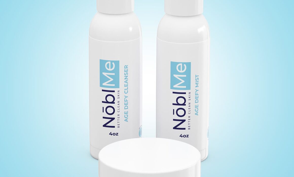
The journey began with modeling and texturing of the products. Our team worked closely with NōblMe to ensure that every detail was modeled to spec. From the sleek curves of the cleanser bottle to the luxurious finish of the age-defying cream jar, no detail was too small. We used 3D modeling techniques to create lifelike replicas of each product, ensuring that textures, reflections, and colors were perfect.

The Beauty Shots

Once the models were created and approved, it was time to bring them to life. We rendered high-resolution images in PNG format, providing NōblMe with crisp, clear visuals that highlighted the products’ features. But we didn’t stop there. To add a unique creative touch, we incorporated NōblMe’s branded “blue burst” background. This burst of color not only aligned with their brand identity but also added a dynamic element to the shots, making the products pop and drawing viewers’ attention immediately.

Beyond the Products: Packaging Design

Understanding that unboxing is a crucial part of the customer experience, we extended our rendering expertise to the packaging. We designed elegant boxes that reflect NōblMe’s brand aesthetics. To add an extra layer of sophistication, we filled these boxes with decorative paper, showing customers how their orders would arrive. This attention to detail in the packaging design reinforces the luxury feel and enhances the overall brand experience.

The Result

The final renderings were nothing short of spectacular. NōblMe received not only the standalone beauty shots of their products but also a complete visual package that included the intricately designed boxes. These renderings have become a key part of NōblMe’s marketing strategy, used across their website, social media, and promotional materials.

Conclusion

At RDC Design Group, we pride ourselves on transforming ideas into visual masterpieces. Our collaboration with NōblMe is a testament to our commitment to quality and creativity. By combining technical precision with artistic flair, we were able to create 3D product renderings that truly resonate with NōblMe’s brand and appeal to their discerning customers. Whether it’s the realistic product textures or the thoughtfully designed packaging, every element works in harmony to tell NōblMe’s story of luxury and rejuvenation.

If you’re looking to elevate your product presentation with stunning 3D renderings, RDC Design Group is here to bring your vision to life.

Share this


RDC_Design_Group_Logo_Design_Everlit_V_Flame_Icon_Thumbnail
May 8, 2024

Everlit

  • Posted By : admin/
  • 0 comments /
  • Under :

EVERLIT

LOGO DESIGN

Project Description: Crafting the Identity for Everlit

Overview: RDC Design Group was thrilled to collaborate with Everlit, a dynamic hard rock band poised to make waves in the music industry. The challenge was to encapsulate the band’s energy, passion, and fierce sound within a logo that would resonate with their audience.

Conceptualization: Understanding Everlit’s ethos was pivotal in conceptualizing the logo. Inspired by the band’s raw intensity and relentless drive, RDC Design Group sought to create a visual identity that would mirror their electrifying performances and bold musical style.

Logo Creation: The focal point of the logo is a stylized ‘Everlit’ typography, hand-crafted to exude a sense of power and strength. The sleek, angular lines convey strength, while the bold lettering commands attention. The choice of font reflects the band’s edgy sound, setting the tone for their brand identity.

Innovative Element: The V Flame Torch Icon: One of the most innovative aspects of the logo is the incorporation of the letter ‘V’ from Everlit into a striking V-flame torch icon. Symbolizing resilience, passion, and the band’s commitment to their artistry, this iconic element adds depth and visual interest to the design. The V Flame Torch stands as a beacon of Everlit’s unwavering determination and their commitment to igniting the stage with their electrifying performances.

Symbolism: Beyond its aesthetic appeal, every element of the logo carries symbolic significance. The flame represents the band’s energy and creativity, while the torch embodies their journey towards self-discovery. Together, they form a powerful emblem that encapsulates Everlit’s ethos and resonates with their fan base.

Conclusion: In collaboration with Everlit, RDC Design Group has crafted a logo that not only captures the essence of the band but also serves as a visual manifesto of their musical journey. With its bold typography and iconic flame torch, the logo stands as a testament to Everlit’s indomitable spirit and their relentless pursuit of greatness in the world of rock music.

Share this


RDC Design Group - 3D Product Rendering - SteelBox Overview Image
February 24, 2025

STEELBOX

  • Posted By : admin/
  • 0 comments /
  • Under :

STEELBOX

3D RENDERING

Project Description

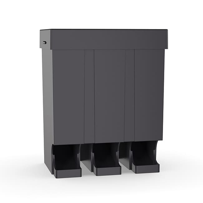
For this project, we partnered with a company launching a specialized shotgun ammo case designed for both indoor and outdoor shooting ranges. The case offers versatility in placement, capable of sitting on a flat surface or being wall-mounted, and features a removable lid that provides access to three internal ammo columns. Rounds dispense from the bottom for quick and efficient reloading, making it an ideal solution for shooters who need speed and organization.

RDC Design Group is a 3D product rendering company so bringing this design to life with photorealistic visuals is our specialty. We started with precise 3D modeling, ensuring the geometry and proportions aligned with the client’s exact specifications. High-resolution textures and PBR (Physically Based Rendering) materials were applied to replicate the real-world look and feel of the case, capturing surface details like material finish, color, and lighting/shadows/reflection for maximum realism.

To showcase the product’s design and functionality effectively, we created a series of high-quality marketing renders from multiple angles, including front, front open, and back views. These visuals were carefully composed with accurate lighting and global illumination techniques to enhance depth, shadowing, and realism. Our rendering process involved ray tracing for true-to-life reflections and ambient occlusion to add realistic soft shadows, ensuring the product was presented with an unparalleled level of detail.

By leveraging our expertise in 3D visualization, we provided the client with compelling imagery that not only demonstrated the ammo case’s features but also served as a powerful marketing tool. The final renders helped the company showcase the product in a way that traditional photography couldn’t achieve before manufacturing was complete, reinforcing the value of 3D product rendering in modern product development and advertising.

Share this


RDC-Design-Group-Concept-Patent-Drawing-Toothbursh-Patent-Thumbnail
May 23, 2024

Toothbrush Patent

  • Posted By : admin/
  • 0 comments /
  • Under :

TOOTHBRUSH
CONCEPT

PATENT DRAWINGS

Project Description

An independent product inventor approached RDC Design Group with an innovative toothbrush concept. The product aimed to revolutionize oral hygiene by integrating multiple functionalities into a single device. This multifunctional toothbrush included standard toothbrush features, tongue bristles, convenient grips, a reloadable floss wheel and floss cutter, and a refillable toothpaste dispenser.

Objective:
The inventor needed professional assistance to transform their hand-drawn sketches into detailed 3D product models and patent drawings. The end goal was to have precise and professional documentation to support a patent application.

Initial Consultation:
RDC Design Group held an initial consultation with the inventor to understand the vision and specific features of the toothbrush. The inventor provided hand-drawn sketches and explained the intended functionalities of the product.

Feature Analysis:
The team at RDC analyzed the hand drawings, paying close attention to the unique features such as the tongue bristles, reloadable floss wheel, floss cutter, and the refillable toothpaste dispenser. Understanding these components was crucial for accurate 3D modeling and patent documentation.

3D Modeling:
Using CAD (Computer-Aided Design) software, RDC’s engineers and designers began creating a 3D model of the toothbrush. This phase involved translating the 2D sketches into a three-dimensional representation, ensuring all components were accurately depicted.

Special attention was given to the integration of all functionalities in a compact and user-friendly design.

Iterative Design and Feedback:
The initial 3D model was shared with the inventor for feedback. RDC valued the inventor’s input and iteratively refined the design based on their suggestions. This collaborative approach ensured the final model met the inventor’s vision and practical usability.

Creation of Simple 3D Drawings:
Once the 3D model was finalized, RDC created simple 3D drawings. These drawings served as clear and concise visual representations of the product, highlighting key features and their operational mechanisms.

Patent Drawing Preparation:
Patent drawings require precise and standardized formatting. RDC’s team prepared these drawings, ensuring they met all necessary guidelines for patent submission.

The drawings included detailed views of each component: the toothbrush head with tongue bristles, the handle with convenient grips, the floss wheel mechanism, the floss cutter, and the refillable toothpaste dispenser.

Outcome:
High-Quality 3D Model:
The inventor received a high-fidelity 3D model of the toothbrush, which could be used for further development and prototyping.

Professional Patent Drawings:
The final patent drawings were delivered, ready for submission. These drawings clearly demonstrated the novel aspects of the toothbrush, facilitating a smoother patent application process.

Client Satisfaction:
The inventor was extremely satisfied with the collaboration, praising RDC Design Group for their attention to detail, responsiveness, and ability to bring their vision to life.

Conclusion:
RDC Design Group successfully partnered with an independent inventor to transform a visionary idea into a tangible design. Through meticulous analysis, 3D modeling, and precise patent drawing preparation, RDC enabled the inventor to move forward with confidence in their patent application process. This case study exemplifies RDC’s commitment to supporting inventors and fostering innovation through expert design and engineering services.

Share this


RDC_Design_Group_Logo_Design_Jamies_Grilling_Company_Thumbnail
May 3, 2024

Jamie’s Grilling

  • Posted By : admin/
  • 0 comments /
  • Under :

Jamie’s Grilling

LOGO DESIGN

Project Description

Jamie’s Grilling Company sought the expertise of RDC Design Group to lead a comprehensive rebranding endeavor and breathe new life into its logo. Embarking on an in-depth exploration of Jamie’s Grilling Company’s core essence, values, and unique position in the culinary market, we delved into its history and aspirations to ensure the new logo would authentically capture its identity.

The logo development journey commenced with a series of meticulously crafted sketches, capturing visual elements emblematic of Jamie’s Grilling Company’s passion for flavor, quality, and outdoor cooking. These initial sketches underwent refinement and digital transformation, enabling a deeper exploration of design possibilities. As concepts evolved, font treatments were carefully curated to convey a sense of warmth and expertise, aligning seamlessly with the company’s image.

Furthermore, a thoughtful selection of colors ensued to evoke the company’s vibrant energy and resonate with its barbecue-loving audience. Throughout the iterative process, we incorporated invaluable feedback from Jamie’s Grilling Company, ensuring their vision was seamlessly integrated at every turn. This collaborative effort led to several revisions, each refining the design to perfection.

The culmination of this creative journey resulted in the unveiling of a professional logo, authentically communicating Jamie’s Grilling Company’s ethos and resonating deeply with its customers. The finalized emblem stands as a powerful symbol of the company’s dedication to exceptional grilling experiences, embodying its legacy while projecting a forward-thinking approach to outdoor cooking.

Share this


RDC-Responsive-Web-Design-Layout-Tile-RIKOS-PIZZA-min
April 3, 2024

Riko’s Thin Crust Pizza

  • Posted By : admin/
  • 0 comments /
  • Under :

RIKO’S PIZZA

WEBSITE DESIGN
WEBSITE DEVELOPMENT

Project Overview

In a collaborative effort between RDC and our esteemed Internet marketing partner, we undertook the ambitious task of rebuilding the digital presence of Riko’s Pizza—a beloved thin crust pizzeria with a rich history spanning across Connecticut and New York. The challenge at hand was to revamp Riko’s website, which was housed on an outdated platform, and provide them with a modern, user-friendly solution to enhance their online visibility and streamline their operations.

Recognizing the importance of transitioning Riko’s website to a more dynamic and accessible platform, our team embarked on leveraging WordPress to rebuild the site from the ground up. This transition not only ensured a seamless user experience but also empowered Riko’s with a robust backend system that allows them to effortlessly manage and update their content moving forward.

The primary focus of this endeavor was to replicate and rebuild the website but also to implement industry-leading SEO practices to elevate Riko’s online visibility and drive traffic to their digital storefront. By incorporating a structured SEO framework, we aimed to optimize the website for search engines, thereby enhancing Riko’s online presence and ensuring that their Internet marketing initiatives could thrive in a competitive landscape.

Through meticulous planning, clear communication, and a shared dedication to excellence, RDC and our Internet marketing partner successfully transformed Riko’s online platform into a sophisticated, user-centric portal that encapsulates the essence of their iconic pizzeria. The new website serves as a testament to the power of collaboration and innovation in delivering a digital experience that reflects the quality and authenticity of Riko’s Pizza.

Moving forward, Riko’s is equipped with a state-of-the-art website that not only showcases their renowned thin crust pizzas but also provides them with the tools and framework necessary to engage with customers, drive conversions, and cultivate a thriving online presence.

Visit Website

Share this


RDC Design Group Logo Design PeacePage Overview
May 3, 2024

PeacePage

  • Posted By : admin/
  • 0 comments /
  • Under :

PEACEPAGE

BRANDING & LOGO DESIGN

Project Description

PeacePage entrusted RDC Design Group with the task of creating the startup social media platform logo. Starting with an extensive exploration of the PeacePage core essence, values, and distinctive standing in the social networking realm, we delved into their background and aspirations to ensure the new logo would genuinely mirror PeacePage’s identity.

The logo design unfolded through a series of crafted sketches, capturing visual elements emblematic of PeacePage’s dedication to peace, harmony, family, and love. These initial sketches underwent refinement and digital translation, facilitating a deeper dive into logo design possibilities. As concepts evolved, font treatments were carefully selected to convey modernity and sophistication, seamlessly aligning with PeacePage’s image.

A thoughtful palette selection ensued to evoke the brand’s vibrant spirit and resonate with its diverse user community. Throughout the iterative process, we integrated invaluable feedback from the PeacePage team, ensuring their vision was seamlessly woven into each stage. This collaborative effort led to several revisions, each honing the design to perfection.

The apex of this creative odyssey materialized in the unveiling of a polished logo, authentically articulating PeacePage’s ethos and resonating profoundly with its audience. The finalized emblem stands as a potent symbol of the brand’s standing in the digital landscape, embodying its legacy while projecting a forward-thinking ethos.

Share this


RDC 3D Product Rendering Fox Labs Family-Shot-Limited-Reflection-min thumbnail
April 4, 2024

Fox Labs

  • Posted By : admin/
  • 0 comments /
  • Under :

FOX LABS

3D PRODUCT RENDERING

Project Description

We’re thrilled to showcase the 3D renders we created for Fox Labs’ range of pepper spray canisters. We worked diligently to capture the essence of these products, highlighting their various sizes and colors.

From compact keychain versions to larger canisters, we ensured that each design was accurately represented in high detail. In particular, the family shot captures all the different varieties together in one lineup. This visual display not only showcases the diverse options available but also emphasizes the brand’s commitment to providing a comprehensive lineup of pepper spray solutions.

Additionally, we featured the Sudecon Wipe, an essential accessory for anyone who has experienced the effects of pepper spray.

Furthermore, we didn’t forget to include the extraction hose, a unique feature specific to one of the canister models. Our 3D render accurately portrays this important component, illustrating how it enhances the functionality and accessibility of the product.

Overall, the 3D renders for Fox Labs’ pepper spray canisters offer a visually appealing and comprehensive representation of their product line.

Each render showcases the different sizes, colors, and features, ensuring that viewers have a clear understanding of the options available and the brand’s commitment to quality and innovation.

Share this


RDC Design Group - 3D Product Rendering - 3D Smart Phone Creative Rendering - ZmBIZI - Z2 - Overview
June 27, 2024

ZmBIZI

  • Posted By : admin/
  • 0 comments /
  • Under :

ZmBIZI

3D PRODUCT RENDERING

Project Description:

In the ever-evolving world of mobile technology, ZmBIZI stands out as a company committed to pushing the boundaries of what smart phones can achieve. Their latest offering, the Z2 smart phone, is a testament to this commitment, blending advanced technology with sleek design. To bring the Z2 to life visually, ZmBIZI partnered with RDC, a highly-recommended 3D modeling and rendering company, to create stunning photorealistic 3D renderings that highlight the phone’s features and aesthetics.

Z2 Smart Phone: A Technological Marvel

The Z2 smart phone is packed with features designed to enhance user experience and functionality. Key specifications include:

  • Integrated Payment Terminal: One of the standout features of the Z2, this allows users to process payments directly through their phone, making it an invaluable tool for businesses.
  • High-Resolution Display: Offering vibrant colors and sharp details, the Z2’s display ensures an exceptional viewing experience.
  • Advanced Camera System: Equipped with top-tier camera technology, the Z2 enables users to capture high-quality photos and videos.
  • Transparent Back Design: This unique design element allows users to see the internal components of the phone, adding a futuristic and sophisticated touch.

For a detailed look at the Z2’s specifications, you can visit here.

RDC’s Role in Bringing the Z2 to Life

To showcase the Z2’s impressive design and features, ZmBIZI enlisted the expertise of RDC. Known for their skill in creating photorealistic renderings, RDC played a crucial role in the visual presentation of the Z2.

Photorealistic Renderings
RDC produced high-quality beauty shot renderings of the Z2 for use on ZmBIZI’s website and in marketing materials. These images highlight the phone’s sleek design from multiple angles, giving potential customers a comprehensive view of the product.

Showcasing Multiple Colors
One of RDC’s notable contributions is the depiction of the Z2 in various colors. These photorealistic renderings allow customers to visualize the phone in their preferred shade, whether it’s classic black, bold red, or sophisticated purple.

Dynamic Angles and Creative Views
RDC didn’t just stop at static images; they created dynamic views of the Z2. This includes creative renderings of the phone floating to simultaneously show both the front and back. Such innovative presentations not only catch the eye but also convey the phone’s design excellence.

Family Lineup
To further enhance the marketing appeal, RDC created a family lineup rendering that shows all three variations of the Z2 floating together. This comprehensive view helps customers see the options available and choose the one that best suits their needs.

Highlighting Internal Components

One of the most unique aspects of the Z2 is its see-through back, which reveals the phone’s internal components. RDC worked closely with the physical product to understand its intricate details and recreated these components in 3D. This transparent design element not only adds an aesthetic appeal but also emphasizes the technological sophistication of the Z2.

Conclusion

The collaboration between ZmBIZI and RDC has resulted in a visual masterpiece that perfectly complements the Z2’s advanced features. Through photorealistic renderings, multiple color showcases, dynamic angles, and a detailed view of the internal components, RDC has helped ZmBIZI present the Z2 in a visually compelling manner.

As ZmBIZI continues to innovate and expand its product line, their partnership with RDC exemplifies how technology and artistry can merge to create products that are both functional and beautiful. The Z2 smart phone, with its unique features and stunning visual presentation, is set to make a significant impact in the market.

Share this


RDC_Design_Group_Logo_Design_Son_Et_Lumiere_Thumnail
May 20, 2024

Son Et Lumiere

  • Posted By : admin/
  • 0 comments /
  • Under :

SON ET LUMIERE

LOGO DESIGN

Project Description: Title: “Sonic Illumination: Crafting the Identity for Son Et Lumiere”

Introduction: In the vibrant world of events, where sound and light converge to create mesmerizing experiences, Son Et Lumiere stands as a beacon of innovation and excellence. RDC had the privilege of crafting a unique visual identity for this dynamic company, capturing the essence of their expertise in sound and lighting. Through meticulous design, we embarked on a journey to encapsulate the fusion of audio and visual elements that define Son Et Lumiere’s offerings.

Conceptualization: Our design approach centered on the synthesis of form and color to evoke the sensory delight that Son Et Lumiere brings to its audiences. We envisioned shapes that not only symbolize sound waves but also embody the dynamic interplay of light, casting an ethereal aura over every event. The choice of blue, purple, pink, and red hues was deliberate, each color representing a facet of the immersive lighting experience – from the calming blue to the energetic red, every shade mirrors the spectrum of emotions evoked by Son Et Lumiere’s performances.

Execution: With precision and creativity, we translated our conceptual vision into a captivating logo that speaks volumes about Son Et Lumiere’s identity. The incorporation of bold typography reflects the company’s confident and assertive approach, mirroring the commanding presence they bring to every event they illuminate. The seamless integration of shapes and colors creates a harmonious visual symphony, resonating with the brand’s commitment to delivering unforgettable auditory and visual experiences.

Result: The final logo stands as a testament to our collaboration with Son Et Lumiere, encapsulating their essence in a visual identity that is both striking and sophisticated. It serves as a beacon, guiding audiences towards the immersive world of sound and light crafted by the company. With its bold typography and vibrant hues, the logo leaves an indelible impression, inviting viewers to immerse themselves in the sensory extravaganza that awaits at every Son Et Lumiere event.

Conclusion: Crafting the logo for Son Et Lumiere was not merely about design; it was about capturing the essence of a company that breathes life into events through the transformative power of sound and light. Through our collaboration, we have created a visual identity that resonates with the spirit of innovation and excellence that defines Son Et Lumiere, setting the stage for countless unforgettable experiences to come.

Share this


« First‹ Prev45678910Next ›Last »

Recent Posts

    Recent Comments

    No comments to show.
    Recent Comments
      Archives
      Categories
      • No categories
      Meta
      • Log in
      • Entries feed
      • Comments feed
      • WordPress.org
      Archives
      Categories
      • No categories